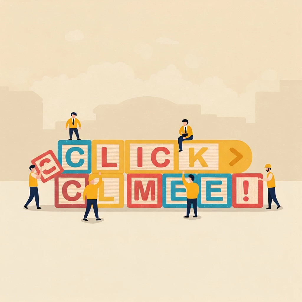
- 1. What exactly is a call to action?
- 2. Why calls to action really matter for your website
- 3. Easy steps to creating an effective call to action
- 4. Examples of calls to action that work well
- 5. Common mistakes to avoid with your calls to action
- 6. How many calls to action should you have on a page?
- 7. Key things to consider when crafting your calls to action
- 8. In conclusion: Getting more action from your website is achievable
- 9. Further reading
Imagine more visitors booking tickets for your events, signing up to your newsletter in droves, or generously supporting your cause. How can you make that happen? Often, the answer lies in something straightforward yet incredibly powerful: well-crafted calls to action.
What exactly is a call to action?
A call to action, or CTA, is simply an instruction you give to your website visitors, guiding them towards a specific action you want them to take. Think of it as a signpost on your website, clearly indicating the next step. Common examples include buttons that say “Book Tickets Now,” links inviting you to “Find Out More,” or prominent buttons urging you to “Donate Here.”
Why calls to action really matter for your website
CTAs are the engine that drives your website towards achieving its goals. Whether you aim to boost sales, expand your email list, or gather crucial contributions, an effective call to action is essential. It provides clear direction for your users, preventing them from aimlessly browsing and encouraging them to engage in meaningful ways. By strategically placing and wording your CTAs, you significantly improve user experience and increase the likelihood of achieving your desired outcomes.
Easy steps to creating an effective call to action
Creating compelling calls to action doesn’t need to be complicated. Here are some easy steps to follow:
- Be clear and direct: Use simple, unambiguous language that leaves no room for misinterpretation. For example, instead of “Submit,” try “Send Enquiry;”
- Use action verbs: Start your CTAs with strong verbs that prompt a response and encourage immediate action. Think “Book,” “Join,” “Support,” and “Download;”
- Show the benefit: Clearly communicate what the user will gain by clicking the call to action. For instance, instead of “Learn More,” consider “Discover Exclusive Offers;”
- Visual considerations: Make your CTAs stand out visually. Use contrasting colours for buttons, ensure they are an appropriate size for easy clicking or tapping, and place them in prominent positions on the page for maximum visibility;
- Consider urgency (where appropriate): A sense of immediacy can sometimes motivate users to act now, e.g., “Limited Availability – Book Today”. However, be mindful that overuse or insincere urgency can be perceived negatively; and,
- Think about your audience: Tailor your message to resonate with the specific interests and needs of your target audience. A CTA for a younger audience might use more informal language than one aimed at professionals.
Examples of calls to action that work well
Let’s look at some examples of effective calls to action:
- A prominent “Buy Tickets” button on an event website. Often using a bright colour and placed near event details, will clearly directs users to make a purchase. The benefit is obvious: gaining access to the event.
- A “Sign Up for Our Newsletter” link. Placed in the footer or as a time-lapsed pop-up, encourages users to subscribe. The implied benefit is receiving valuable updates and exclusive content.
- A clearly visible “Support Us” button on a charity website. Located in the header or a dedicated donation section it directly invites users to contribute. The benefit is the opportunity to make a positive impact.
These examples work well because they are clear, use action-oriented language, and often subtly highlight the benefit to the user.
Common mistakes to avoid with your calls to action
Just as there are effective CTAs, there are also common pitfalls to avoid:
- Vague wording: CTAs like “Click Here” or “Submit” offer no indication of what will happen and are unlikely to work. Instead, try “Download Our Free Guide” or “Submit Your Application.”
- Buttons that are easily missed: If your CTAs hide in their surroundings or are obscurely placed, users won’t see them. Ensure they have sufficient contrast and are positioned strategically. Alternatively, introduce space around the CTA and make it considerably larger than other content.
- Too many options: Presenting users with too many choices can lead to inaction. Focus on the primary goal of the page. For example, a landing page designed to sell a specific product should have a prominent “Add to Basket” button. Don’t clutter it with numerous other links. Keep secondary options much smaller and separated from the primary CTA.
- Too quick to interrupt: Don’t present a “Sign Up for Our Newsletter” box as soon as a visitor arrives. It interrupts visitors before they find the value in your content, preventing them fulfilling their primary objective. It is annoying and usually results in them dismissing your CTA, which prevents you from fulfilling your goal. Don’t interrupt them too early, wait for them to be ready for you to guide them to the next action.
How many calls to action should you have on a page?
Yes, it is perfectly acceptable to use more than one call to action on a page. Generally, it’s best to have one main call to action that aligns with the primary goal of the page. This can be complemented by a few other relevant, secondary options if needed. The key is to avoid overwhelming your visitors with too many choices.
A primary call to action should be visually dominant and strategically placed to capture immediate attention. This could involve using a larger, more prominent button with a contrasting colour.
Secondary calls to action, on the other hand, can be less visually striking and placed in less prominent areas. For instance, on a product page, the primary CTA might be “Add to Basket.” Then, the secondary CTAs could include “View Related Products” or “Add to Wishlist,” presented as less prominent buttons or links. This visual hierarchy guides users towards the main conversion goal while still offering alternative engagement options. This is useful to keep users engaged when they’re not ready to make the leap you want them to make.
Key things to consider when crafting your calls to action
Creating an effective call to action requires careful consideration:
- Understand your audience: Knowing their needs, pain points, and motivations is crucial for crafting CTAs that resonate. What are they hoping to achieve by visiting your website?
- Align with the page’s purpose: Ensure that every CTA directly supports what you want the page it’s on to achieve. A blog post aimed at generating leads might have a primary CTA to “Download Our Free Ebook” and a secondary CTA to “Subscribe to Our Newsletter.”
- Consider the context: Make sure the CTA flows naturally from the surrounding content. For example, after describing the benefits of a service, a logical CTA would be “Request a Free Consultation.” Conversely, a generic “Contact Us” in this context might feel less compelling.
- Test and refine: Continuously monitor the performance of your CTAs to see what resonates best with your audience. A/B testing different wording, colours, and placements can yield valuable insights and lead to improved conversion rates.
In conclusion: Getting more action from your website is achievable
Implementing effective calls to action is a straightforward yet powerful way to achieve your online goals. You can transform passive website visitors into engaged users by:
- being clear;
- using strong action verbs;
- highlighting benefits; and,
- avoiding common mistakes.
Start implementing these strategies to see better results from your website today. Do you already implement effective calls to action? What are your tips to help others? Let us know your thoughts in the comments below.
Further reading
CTAs that work boosting conversions
From clicks to customers: Maximising your digital ROI
Web accessibility: a simple guide to stop excluding visitors
The compelling case for website accessibility
Choose Redcentaur for tailored, results-driven copywriting
About the author…
Glenn has been a web developer and graphic designer since the early 1990s. He has followed the development of HTML, JavaScript and CSS from the beginning and has caught on to newer technologies, such as PHP.
Never resting, Glenn tries to keep abreast of new developments in his areas of expertise and is always keen to pass on his knowledge to help the web and graphic design community to improve user experience.
Glenn set up Redcentaur to offer easy access to the internet for small businesses and individuals, without the cloud of mysticism that surrounds internet technology. The stated objective of Redcentaur is to demystify the web for the uninitiated by offering easy-to-use, end-to-end web solutions and hosting at accessible prices.